GDP, the total value of goods and services produced within the country in a given time interval and the key measure of national economic health, is of course unknowable, but there are a couple of methods of estimating it.
The Expenditure Method assumes that GDP must be equal to total spending by government (G) and consumers (C) plus private investment (I) including investment in residential housing, plus Exports (Ex) minus Imports (Im). (It is worth noting that government spending on transfer payments to citizens does not count.) The formula using this method is GDP = G+C+I+Ex-Im. All the data I am plotting are from the BEA NIPA Tables and are based on this method.
The other method of estimating GDP, the Income Method, is based on an assumption that GDP must be roughly equal to the total income of all the providers of goods and services and uses total salaries and wages, profits, rent and interest received by individuals, with some adjustments, to estimate GDP. None of the data in this post are based on that method.
Given the complexity of the method of estimation, it is not difficult to see why GDP estimates are noisy and late and often must be revised. Just yesterday I read that the earlier estimate of +0.2% real growth for the first quarter of this year has been revised to -0.7%. That is a big shift in the wrong direction, but both numbers are depressingly low. You can read the full report here. (Don’t get unnecessarily distracted. Such short term estimates of GDP are not the point of this post.)
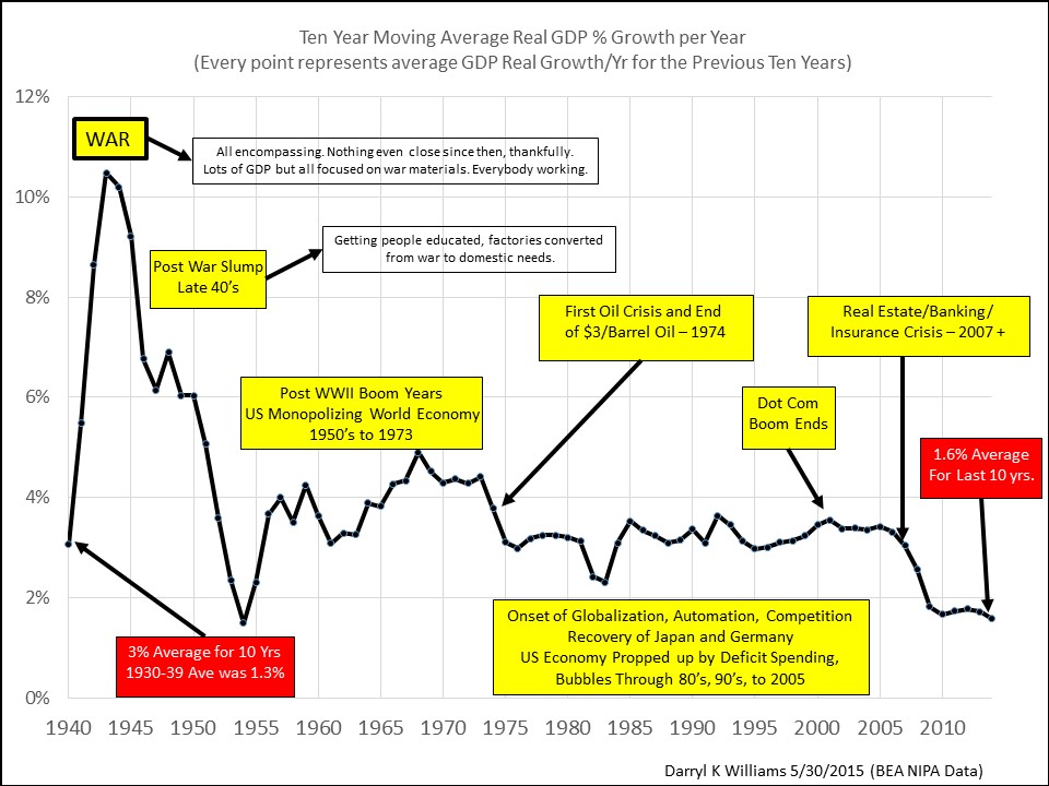
One way to get around the difficulties, errors, and noise in measurement of GDP is to focus on long term running averages. In the chart above, I did that, plotting ten year running averages of “real” GDP growth (inflation removed) all the way back to the end of The Great Depression. These averages of ten years are good solid numbers that nobody is going to be revising.
I can think of only one reader of my blog who would remember The Great Depression and few who would remember the WWII years, but there are many who remember the post war boom years when people were getting good jobs with good incomes right out of high school and enjoying good raises and regular promotions as they watched their mortgage payments shrink to insignificance. And we are all acutely aware of the rising flood of complaints about lack of opportunity and low pay since the turn of the century.
I’m not going to write paragraphs explaining what should be obvious from careful examination of the chart, but I do want to call attention to the facts in the two red blocks, that average real GDP growth for the depression years of 1930 to 1939 was 1.3% per year and that today the average for the past ten years is 1.6%. And we wonder why jobs and raises are scarce! Click on the chart for a high resolution view.
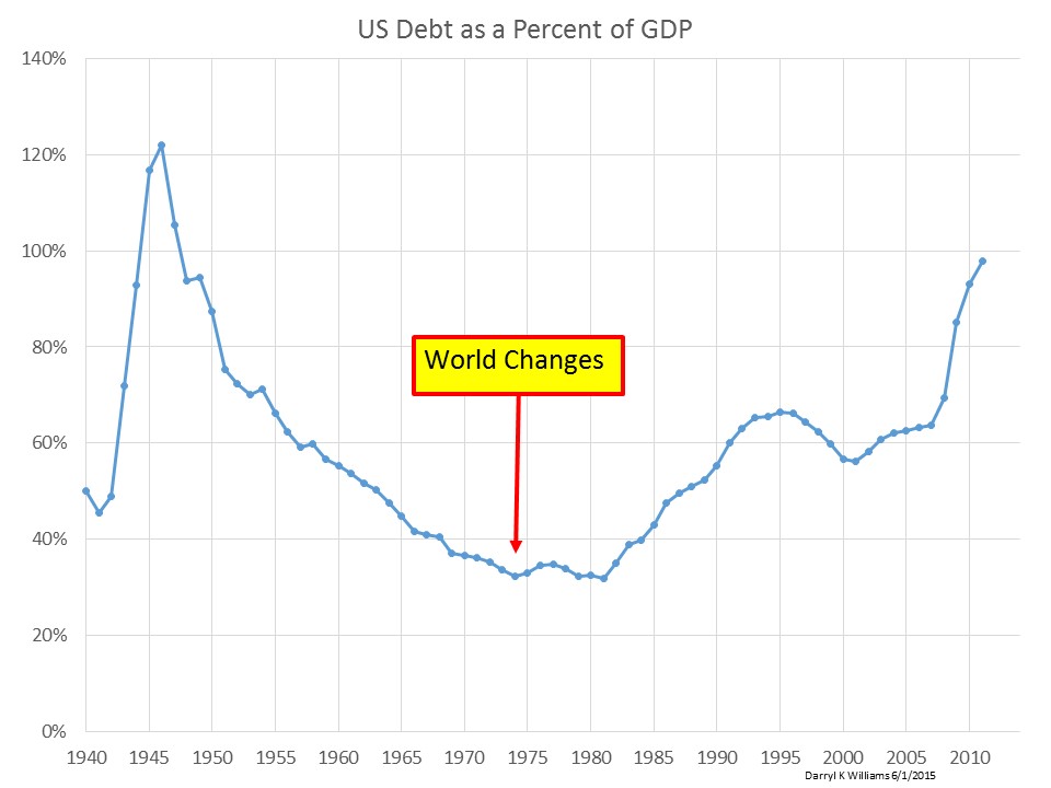
And here is a chart of debt as a percent of GDP on the same time scale. It appears that we compensated for lower GDP growth by borrowing more money!