Having been facing some medical issues for the past couple of years, I am very familiar with the declaration, “I’m going to check your vitals.” Usually that preliminary check is of temperature, pulse rate, respiration rate, blood pressure, blood oxygen, and weight. The seventh, blood glucose level, comes a little later in the process. So far I have been passing the inspections.
At least once a quarter both houses of congress should meet and have honest discussion about federal government fiscal vital signs for which they are fully responsible. They would, if awake and honest, quickly realize they are not passing inspection. Below are the charts of the key data I would recommend reviewing. All the charts are for 2000, a year we experienced some semblance of orderly management, to the chaos of 2023.
By the way, a trillion dollars is almost beyond imagination. Think of it as something over $3,000 for every USA citizen.
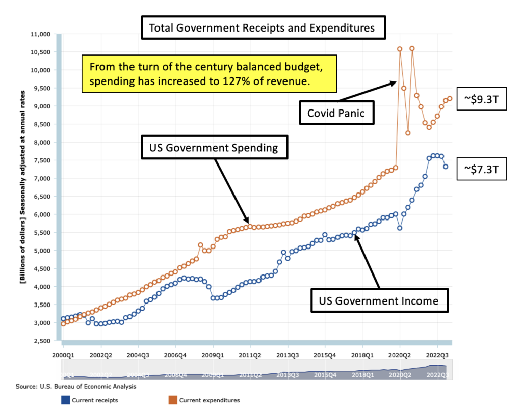
Total Government Receipts and Expenditures
I’m for small federal government focused on providing national defense and preserving and protecting the constitution and leaving the states to mind their own business. But whatever the spending level, there should be income to match it except in cases of emergencies such as WWII. Running multiple trillion dollar deficits year after year, in a strong economy, is a route to eventual disaster. Current GDP is around $25T, and there is plenty of wealth for the government to cover its $9.3T in spending. If the people won’t accept that level of taxation, then spending should be reduced to something they will tolerate.
The problem now is that one side demands more spending and the other demands tax cuts. They have arrived at a disastrous compromise: Lets Do Both! It’s time for a little Wokism in Washington.
How about a constitutional amendment limiting federal spending to 25% of GDP and requiring a balanced budget? That would require some serious work in the nation’s capital and would probably drive down the cost of living there. Here are the pertinent vital signs:
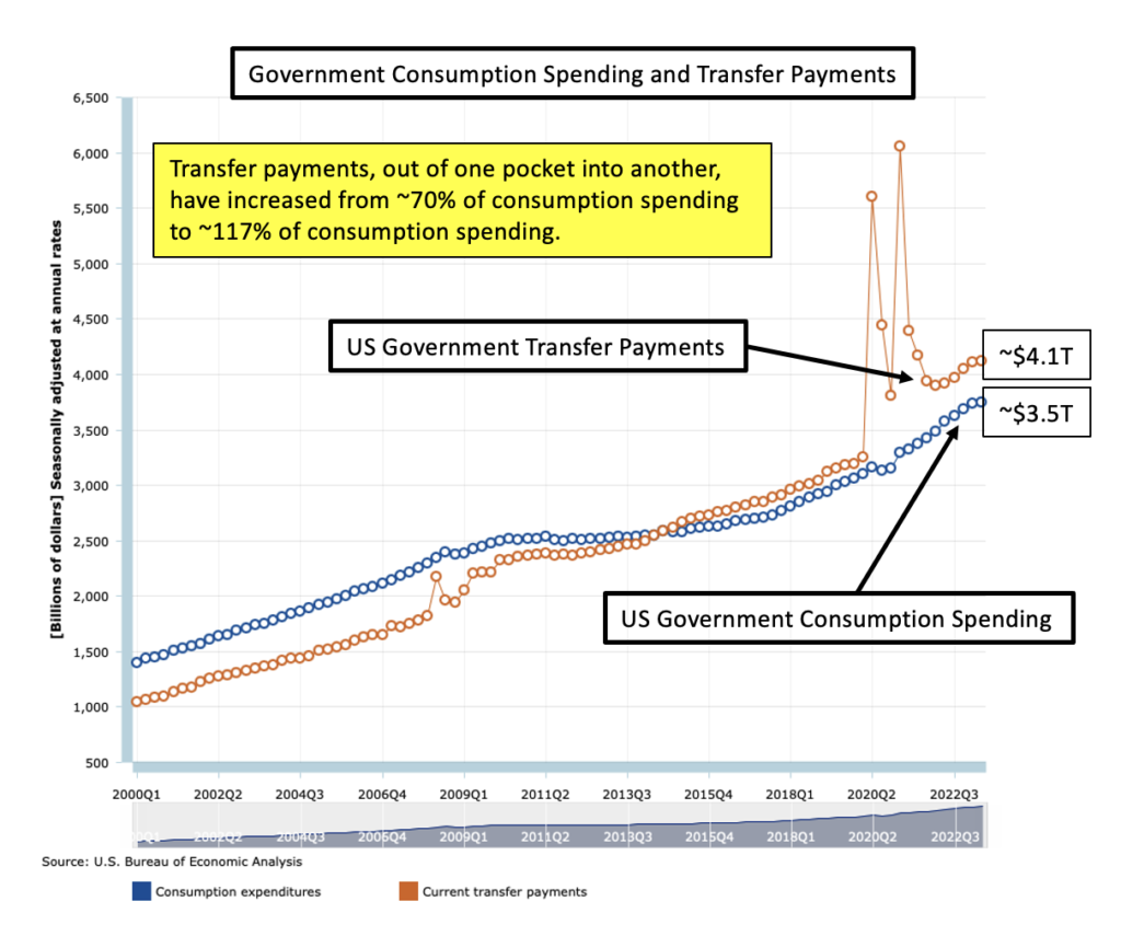
Total Government Consumption Spending and Transfer Payments
The key here is that consumption spending should be going primarily to national infrastructure and national defense to strengthen and protect the nation and keep it an attractive place for private investment. Transfer payments are just going out of one pocket into another, after a Washington DC haircut, and do not improve infrastructure or defense.
Note that consumption spending was 140% of transfer payments in 2000 and is now only 85% of transfer payments. I suspect that congress has learned that transfer payments generate votes while few citizens notice improvements in infrastructure and defense capability. Here are the pertinent vital signs.
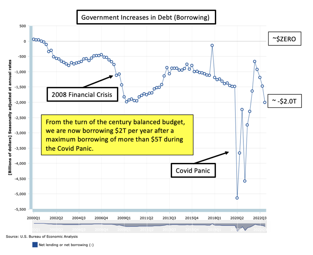
Increases in Federal Government Debt
Recent fake interest rates near zero apparently motivated increased borrowing, but, interest rates are now up significantly and trouble looms. We had debt in the year 2000, but at least it wasn’t growing. Now it is increasing at a rate of $2T per year! That matches the difference in income and spending in the first chart. Here is the pertinent vital sign:
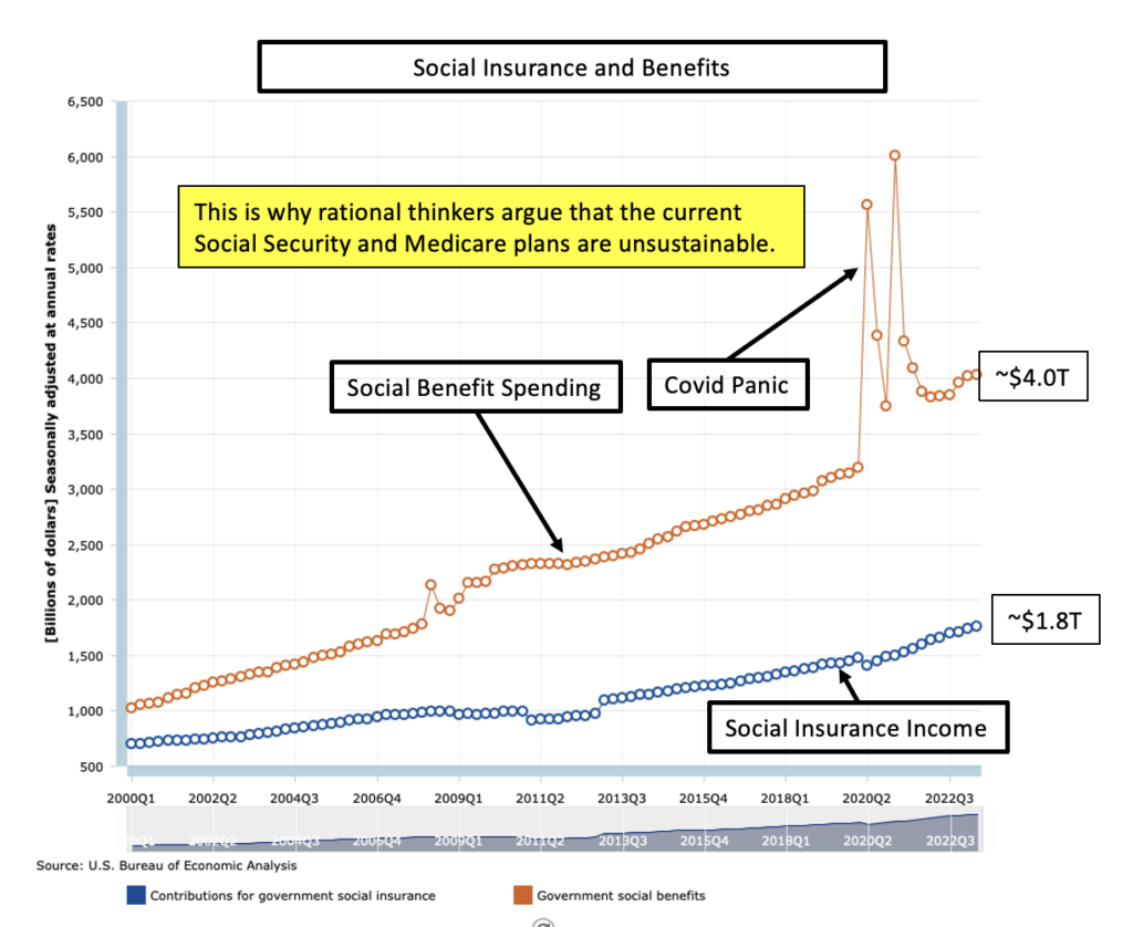
Social Insurance and Benefits
We currently have generous health care coverage for seniors on Medicare and decent incomes for many retirees receiving Social Security. However, we are not paying the bills except with borrowed money. It has always been more tempting for congress to increase benefits than to balance the budgets. Doing so is a perfect example of selfish and cowardly irresponsibility. Here are the pertinent vital signs:
The Prescription
Most of us want our 250 year old democratic republic to survive. For that to happen, we have to go to work on these vitals. That will cause some pain and discomfort, like surgery and hospital recovery time, but not as much as an unmanaged revolution resulting in some form of dictatorship or in unbridled inflation of our currency. Both are real dangers at this point.
Data Source
The US Department of Commerce Bureau of Economic analysis is the source of the data and charts. Using that data, we can all figure out what the TRUTH is. It is usually possible for politicians to carefully choose a couple of data points to justify self-serving statements, but the long term trends depicted in the charts above are undeniably indefensible.
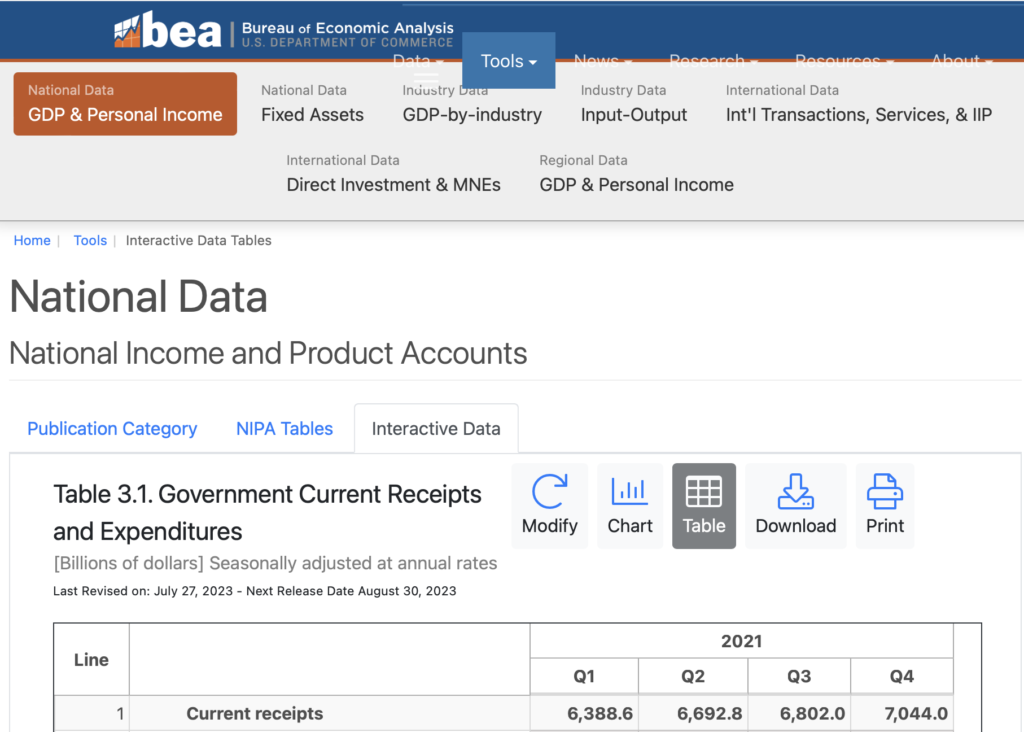
A link to the data is HERE. Click on it, and below is what you see. Using “Modify” to change years and “Chart” to create graphs, the data can be plotted as in the examples above. I doubt that our members of congress will figure out how to do it but maybe they have some bright, rational, and patriotic staff members who will show them or do it for them.
There is a fall 2004 update of these charts HERE.